Designing a research-backed onboarding experience to improve app engagement
Project Overview
Project Details
Role
UX Designer, UX researcher
Duration
4 months
Responsibilities
Mobile app design, user & market research, prototyping
Tools Used
Problem
Without an onboarding flow, CoinWa, a gamified financial literacy mobile app, was experiencing high user drop-off during testing. CoinWa is a Waterloo-based start-up and is in the pre-launch stage of their business journey.
Outcome
Through extensive user research and iterative design, CoinWa promoted user retention with an effective, informative and user driven onboarding flow that optimizes for personalizing the app and segmenting users for increased growth potential.
Key Results
Onboarding Completion Rate
Improvement in user completion of the onboarding flow after implementing the new design
Net Promoter Score
Increase in Net Promoter Score through improved personalization
Tester Drop-off
Reduction in design iteration time through organized component library and design system
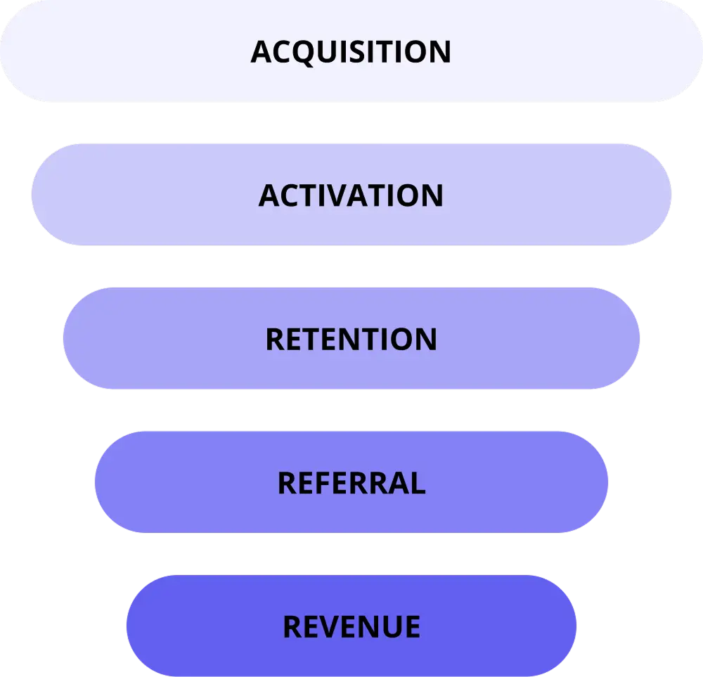
Business Challenge
CoinWa is successfully attracting the attention of potential users through their social media platforms. However, upon testing the app, most users are unable to complete tasks, navigate through the app, or leave generally underwhelmed.
Business Problems
- Low user retention
- High user drop off
- Inability to personalize or segment users
- Wasted acquisition spending
Implication
Without effective onboarding to drive activation, most acquired users disengaged before reaching meaningful product use, limiting retention and revenue growth.
Business Goals
- Increase Onboarding Completion Rate-Indicator of Early Retention
- Reduce Early User Drop-off
- Increase Personalization and User Segmentation
- Optimize Acquisition Spending
User Goals
- Increase User Confidence
- Get Immediate Clarity on Product Value
- Experience a Seamless Onboarding Journey
- Develop Motivation for Continued Engagement
Research & Analysis
Insights from competitive analysis
For competitive analysis, I studied Duolingo's approach to understand best practices in educational app design:
🚀 Early engagement increases retention: Letting users experience core functionality reduces drop-off and builds immediate interest
🧩 Progressive disclosure reduces cognitive load: Presenting one simple question or task at a time helps users stay focused and committed through onboarding
🎮 Gamification motivates behaviour: Incorporating progress bars, streaks, and small rewards during onboarding encourages users to complete the flow
🎯 Personalization increases relevance: Tailoring the user experience based on onboarding inputs (e.g., goals, skill level) enhances engagement and perceived value
💬 Conversational tone improves approachability: Friendly language, playful visuals, and positive reinforcement make users feel safe to explore and learn
User testing
While having analyzed the existing designs and mapped out some of the potential changes, I thought it is best to get user input to measure current engagement, study user interactions and get feedback for the onboarding process. Thus, I organized CoinWa's previous designs (which were spread across three different software) and made a working prototype to prepare everything for user testing.
Usability studies:
- Type: Moderated, remote and in-person
- Duration: 30 mins
- Audience: Teens ages 15-18
- Number of people: 4 (1 in person, 3 remote)
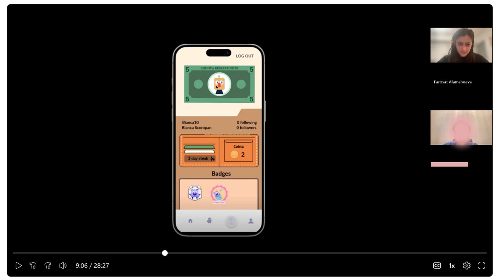
Screenshot from one of the usability study sessions (participant blurred for privacy)
Insights from usability studies
- Users found navigation difficult without a tutorial
- Most users said that the level of the lesson was significantly below their current level of knowledge
- Users were not able to complete several tasks
- Users struggled to locate key actions
- Some buttons were not clearly defined and users thought it was just text
Understanding Kiyan
Says
"I have a relatively good knowledge of financial literacy and did not feel challenged by the lesson. The first lesson being so elementary makes me think that many of the beginning levels of the game will be redundant."
Thinks
"Why can't I start at my level instead of at the beginning?"
Does
"May skip or abandon future sessions"
Feels
"Skeptical about the app's long-term usefulness"
Meet Maya

Maya
The Curious Beginner
Device Usage
Uses school-issued Chromebook for assignments
Uses Android phone for games and learning apps
"I want to learn about money in a way that's not boring or complicated."
Biography
Maya is a high-achieving Grade 10 IB student who thrives on structure and routine. While she's heard her parents discuss saving for university and understands money's importance, she lacks confidence in managing finances herself. She has a small allowance but hasn't developed the habit of tracking her spending. Her parents handle most financial matters, and their advice is limited to general statements about saving for the future. She's eager to learn but needs clear guidance on where to start. Given her demanding academic schedule, she values apps that are efficient and straightforward. She's motivated by goal-setting and seeks a learning experience that breaks down financial concepts into digestible pieces without overwhelming her.
🎯Goals
- •Learn the basics of money management (budgeting, saving, and spending wisely)
- •Understand how bank accounts, credit cards, and loans work
- •Learn how to start saving for big goals (travel, home purchase, etc.)
- •Learn how to invest, buy stocks, research, etc.
- •Get a quick overview of how the app works and what it can help me achieve
- •See clear progress indicators and understand my learning journey
😤Frustrations
- •Feels overwhelmed – Finance seems complex, and she doesn't know where to start
- •No real-world experience – She has little exposure to managing money in real life
- •Unsure about digital information – Online influencers talk about investing, side hustles, and crypto, but she can't compare this against official knowledge
- •Misleading Ads – Follows ads about finance apps but finds after download that many apps are directly related to money management (investing, banking, etc.), or not meeting her needs/complicated to use
Key User Pain Points
Insights from usability studies
Through user testing and research, we identified critical pain points that were impacting user engagement and retention.
Navigation Difficulties
Users found navigation difficult without a tutorial and needed guidance to understand the app structure.
Content Level Mismatch
Most users said that the level of the lesson was significantly below their current level of knowledge.
Task Completion Failure
Users were unable to complete tasks and felt overwhelmed during their first app experience.
High Early Drop-off
Users left the app feeling underwhelmed and disengaged before experiencing the core product value.
Design & Implementation
Reflecting on the insights from the usability studies and other research, I designed the intake quiz flow, and the app tutorial/run through to help new users with the app familiarization process.
Intake Quiz
For the intake quiz, it was important to create a powerful intake process that will assess the user's current level of financial literacy and place them in the appropriate level of learning on the app so as to prevent redundancy. During user testing, we found that users felt the first lesson was common knowledge and they did not feel like they learned anything new. The inability to skip the lesson was one of the pain points many testers experienced. Hence, I used diagramming to lay out the learning path, which helped me create the structure for the quiz and the algorithm through which it would distribute users across lessons matching their level.
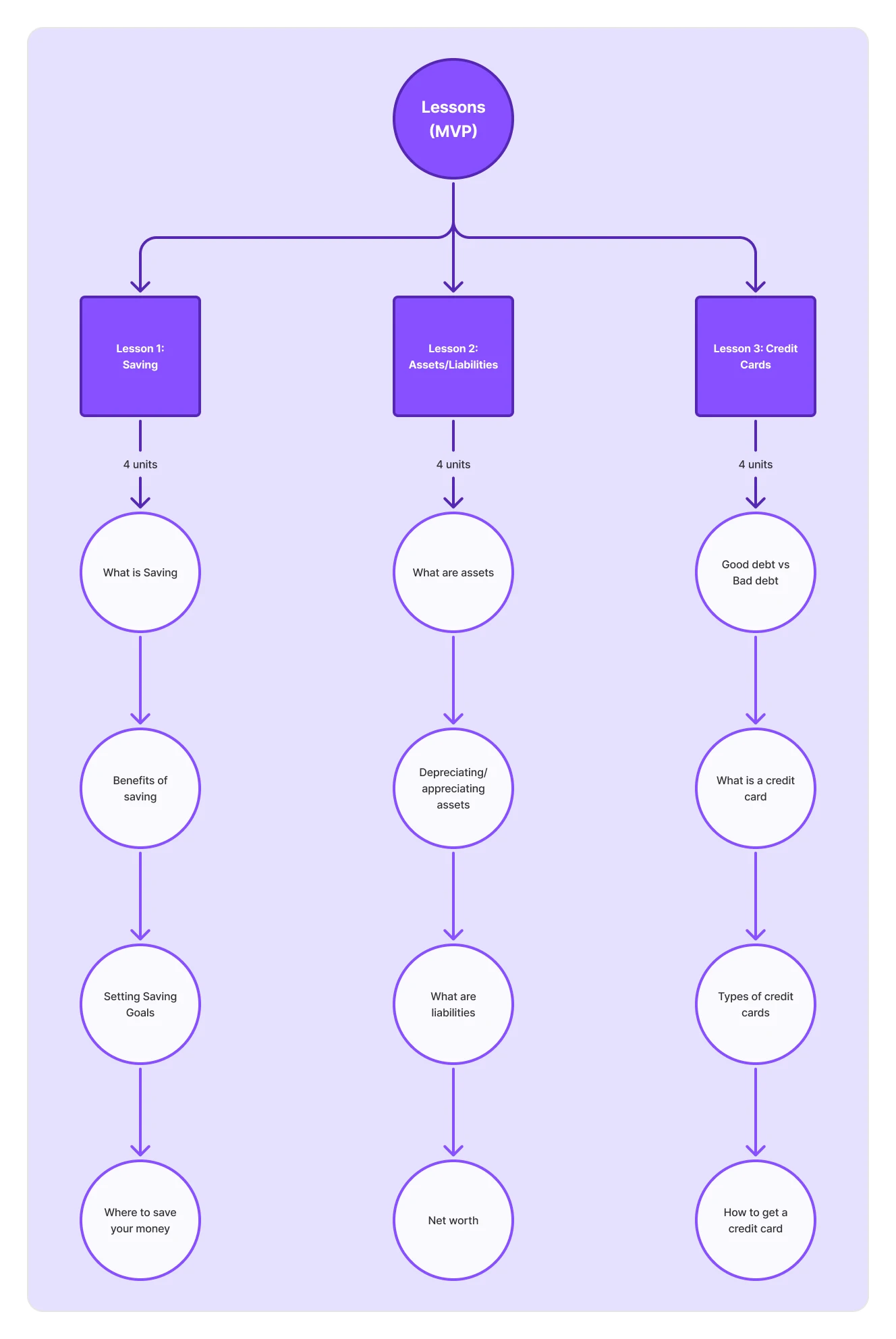
Lessons flow diagram
Challenge 1: - Ideal placement of questions and tutorial
Based on research insights we narrowed down the onboarding process to 3 mains components:
1. The tutorial of the app/app run-through
2. Questionnaire about user's goals for using the app (to help personalize the app's features to the user)
3. Intake quiz to determine user's current level for placement
The next challenge was to place these elements strategically in the app so that we achieve the goals of informing the users about the app's features and at the same time gathering enough information to help with goal setting and optimizing the app for individual users. As altogether, these elements can become time consuming, cumbersome and boring, by placing them incorrectly we could risk early drop off.
How might we structure the onboarding flow to maximize user engagement while minimizing cognitive overload?
How might we deliver the intake quiz and goal-setting questions in a way that feels like part of the user's journey, rather than a barrier to it?
Solution:
To determine where best to place the intake quiz and app tutorial, I drew a user flow chart. After several iterations I decided that the following onboarding flow was ideal:
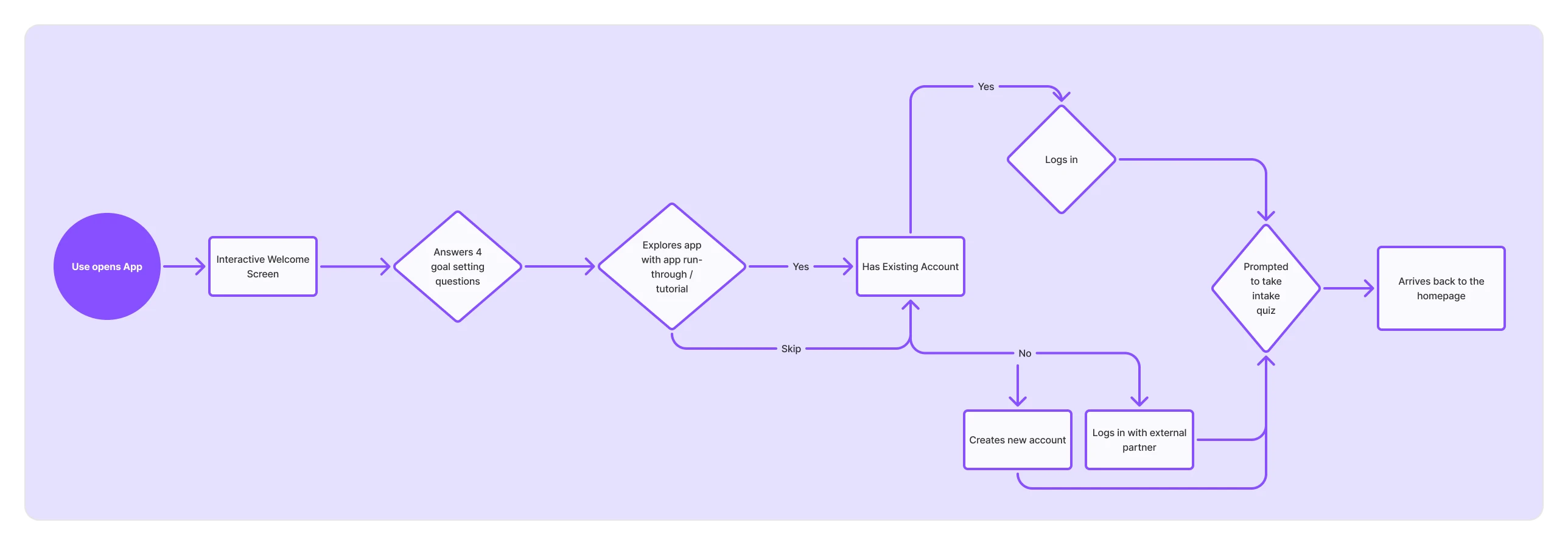
Onboarding flow
Decision Process:
At first I felt that the app should follow the conventional structure of: sign up, questionnaire, and then app run-through, however, when running that prototype, the flow felt excessively long and disengaging. By playing around a bit (and consulting with one of the previous user study participants), I understood that the user should:
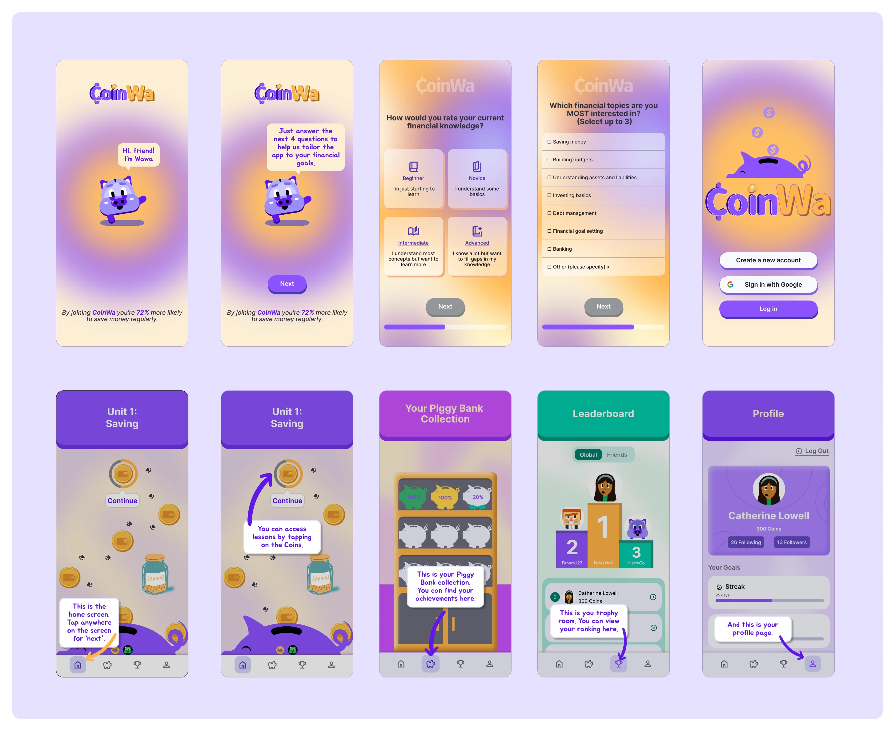
Intake quiz design examples
- be engaged right off the bat
- have frequent break-points
- involve encouraging and friendly language (positive reinforcement)
- include haptics for emotional engagement
- include the log in step after the app run-through (user has seen the app's features and is excited to get started)
- only include the intake quiz in the end (if it is in the beginning, user might feel intimidated and exit the app; if it is the second step, user may feel that the rest of the onboarding process will be long and leave the app; if it is after the app run through and log in step, the user is more likely engage as they are still excited from the latest steps and want to get started).
Above are some of the final designs from the onboarding process. The full flow can be seen in the video in the header.
Challenge 2: - Intake quiz distribution algorithm
Next, we needed to create the questions for the intake quiz which would determine which unit/lesson the user starts from. Considering the number and content of lessons at the time, we came up with 12 questions (4 questions/unit). I then created a distribution system that would place users in the appropriate unit based on their answers. This distribution system can be seen below:
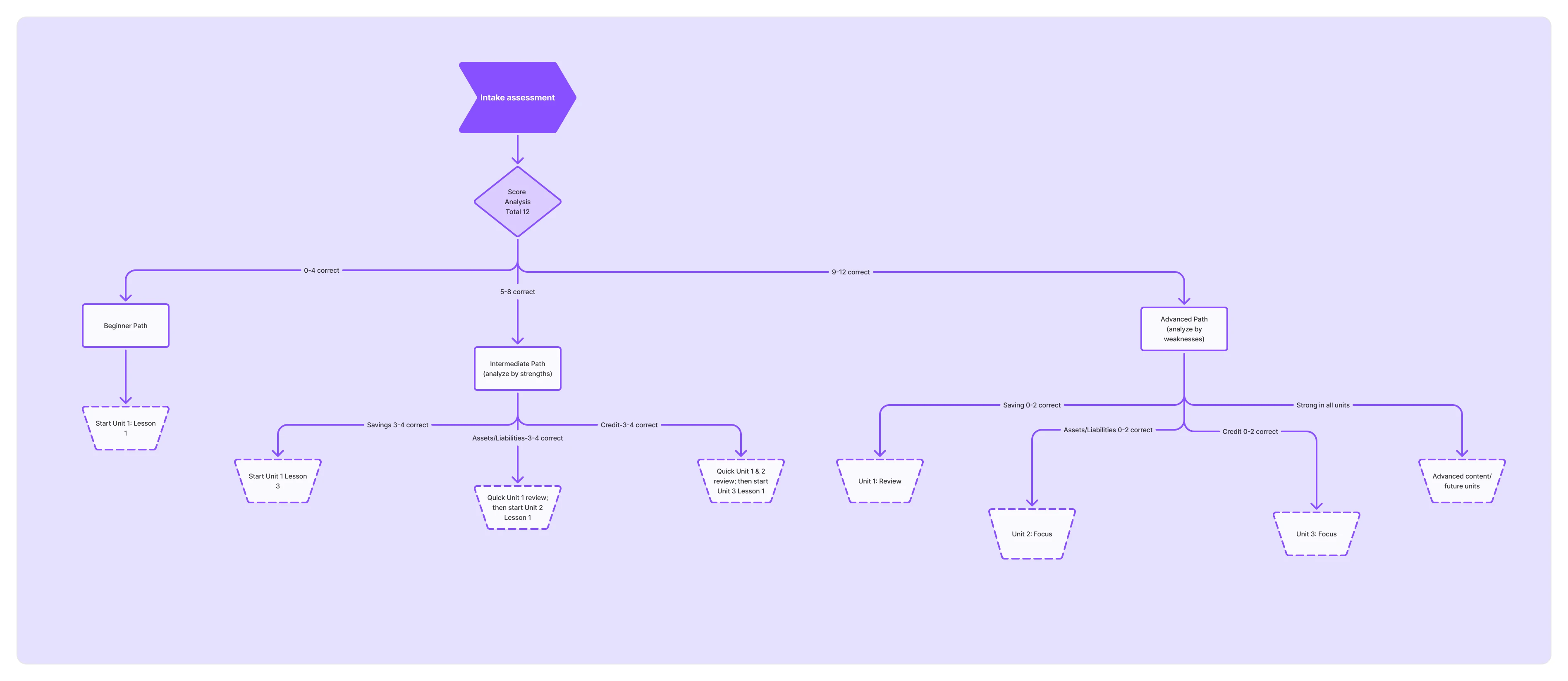
Intake quiz assessment
While this system is specifically designed for the units in the MVP, a similar algorithm can be employed as new lessons are added.
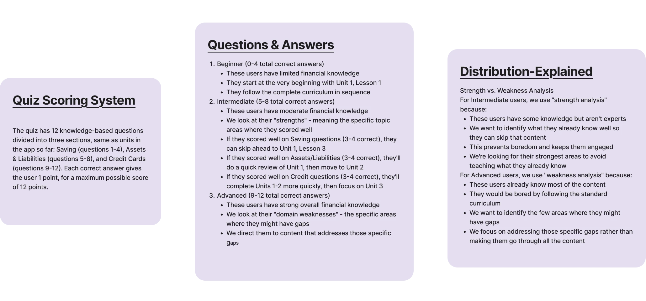
Intake quiz questions, scoring, and distribution
Below are some examples of the quiz designs:
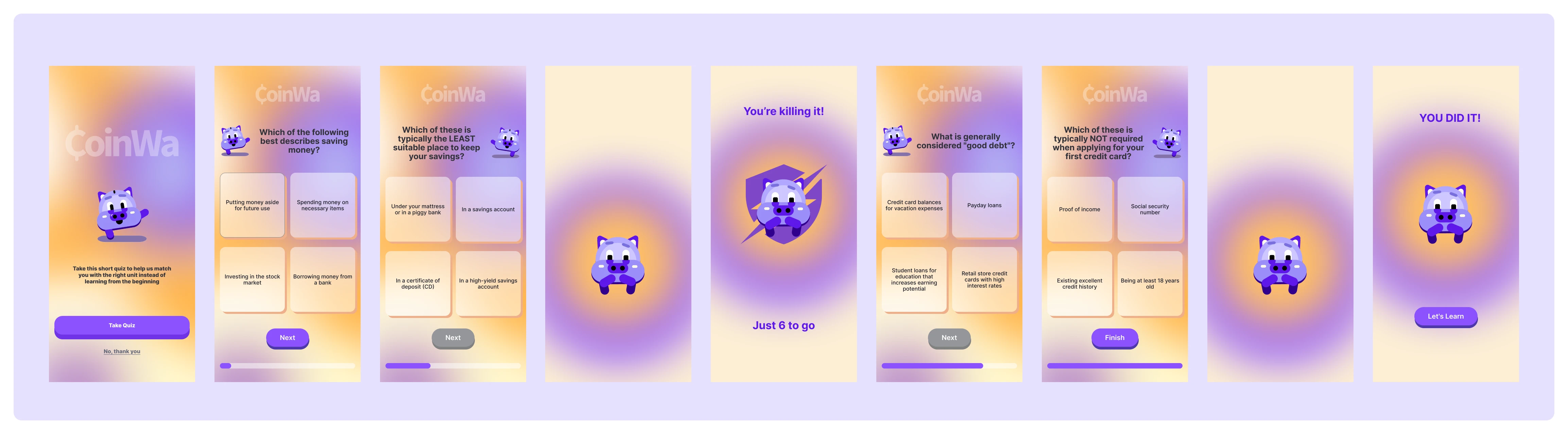
Intake quiz design
Impact & Lessons Learned
Impact
- 100% Onboarding completion
- +60% improvement in perceived clarity
- Supported feature prioritization and growth strategy
- Enabled intelligent content curation and user distribution
- Conducted usability studies to gather real user feedback, ensuring the app was designed with user needs in mind.
- Created an onboarding app run-through to help new users navigate the app smoothly from the start.
- Designed a user distribution system that categorizes users based on an intake quiz, personalizing their learning experience.
Challenges
- Disorganized Design Files – When I joined the team, the design assets were scattered across Canva, Illustrator, and Figma, making it difficult to maintain consistency and efficiency.
- Lack of a Unified Design System – The screens, layers, and frames were not structured or labeled properly, making collaboration and iteration challenging.
- MVP-Code vs. Design Discrepancies – Several coded elements in the MVP were missing in the existing designs, requiring additional effort to align the design with the developed product.
Lessons Learned
- The Importance of a Design System – The disorganized nature of the original files reinforced the need to establish a design system early in the process. A well-structured components library, naming conventions, and design guidelines streamline collaboration and future iterations.
- Efficient Workflow Matters – Properly organizing screens, frames, and assets saves time and makes it easier for the next designer to pick up where I left off. In future projects, I will prioritize maintaining design consistency from the start.