Developing a user-centric platform for climate displacement discourse
Climate Change Adaptation, Dispossession and Displacement (ADD+)-Website design
Role
Web designer, UX researcher
Duration
6 months
Responsibilities
Web Design, Branding, User research, Information Architecture, lo-fi & hi-fi designs, prototyping, usability testing
Tools Used
- Figma
- Adobe Illustrator
Problem Statement
The Problem
ADD+ is a newly funded academic project that wants to establish a website both for external and internal users. The website will serve the purpose of informing visitors of the project's findings regarding climate change adaptation, dispossession, and displacement as well as allowing those interested in the field to connect with the project proponents.
Goal
Design all unique pages of project website to showcase the project's current and future structures, findings, and all other information and outputs in order to keep general audience, as well as stakeholders (sponsors) informed of the project's developments. Provide a consistent design and information architecture, and ensure easy and clear navigation across pages.
Empathize & Define
- Stakeholder interviews
- Competitive Analysis
- Painpoints
Ideate
- Mood-boarding
- Information Architecture
- lo-fi designs
- hi-fi designs & prototyping
- branding
Prototype & Test
- Final designs & prototyping
Research
Stakeholder Interviews
As ADD+ is a new project with no existing outputs, I conducted weekly client interviews to gain a deep understanding of what they wish to showcase on the website (and how). I also interviewed potential users of the website to better understand how best to meet user needs and make the website intuitive.
Insights from client interviews
For this project, I communicated thoroughly with the project's social media team (over 5 people), and it was crucial for all of us to come to unified consensus regarding design requirements. Below are some of the specifications:
It is important to make their 'People' directory as intuitive and accessible as possible
Want clean professional looking design which clearly demonstrate's the project's academic nature
Required a pages to provide a project overview, display future academic papers/outputs, project media, and blog posts.
Website needs search and filtering options to find required contacts/team members easily.
Insights from user interviews
I met with two students at the University of Waterloo (Master's and PhD students), who frequent such websites on a regular basis. They helped me understand the potential users better and cater the website content and design to their requirements. Below are the insights gained from these interviews:
Users require comprehensive, easily navigable research materials
Users would love to see legal frameworks, policy analyses, and community narratives are important.
Open-access datasets and reports would increase the site's usefulness.
Users want to see ground-level community engagement
Clean, professional website design
Advanced search and filtering capabilities
Multimedia integration (videos, infographics, interactive maps)
A well-organized repository of research would be beneficial.
Competitive Analysis
TBTI (Too Big To Ignore)
Strengths:
Robust global network fostering collaboration among researchers and practitioners.
Diverse content formats, including articles, videos, and reports, enhancing user engagement.
Weaknesses: • Lacks interactive elements, such as forums or discussion boards, to facilitate real-time engagement.
TBTI website analysis
Resilience Research Centre
Strengths:
Extensive research methodology documentation
Strong focus on ground-level engagement
Transparent data collection processes highlighted
Weaknesses: • Academic-heavy language • Overcrowded visual design
Resilience Research Centre website analysis
Climate Adaptation Knowledge Exchange (CAKE)
Strengths:
User-friendly interface with robust search and filter functionalities.
Emphasis on knowledge sharing and community engagement.
Weaknesses: • Overwhelming volume of information • Messy navigation
CAKE website analysis
Insights from competitive analysis
Comprehensive & Searchable Content – A well-organized repository of case studies, research, and resources enhances accessibility and usability.
Community Engagement Features – Forums, discussion boards, and collaboration spaces help foster connections among researchers, policymakers, and practitioners.
Multimedia Integration – Videos, interactive maps, and infographics make complex information more digestible and engaging.
Regular Content Updates – Frequent additions of case studies, news, and events keep the platform relevant and encourage repeat visits.
Youth & Regional Focus – Targeting younger researchers and establishing regional hubs can expand reach and impact while promoting localized solutions.
Guided User Experience – Curated content recommendations or topic pathways can help users navigate extensive information more effectively.
Pain Points of Potential Users
Through our research, we identified several key pain points that needed to be addressed:
Many academic papers are behind paywalls.
Existing platforms can be difficult to navigate due to excessive or poorly categorized content.
Many sites rely on static text-based content rather than interactive maps, infographics, or videos.
Few platforms allow researchers, policymakers, and practitioners to connect and exchange ideas.
Users struggle to filter content based on specific themes, geographic regions, or research interests.
Information Architecture Challenge
Information Architecture
After researching similar projects' websites, I developed the general structure for ADD+'s website, which was refined through stakeholder feedback.
Final information architecture for the ADD+ website
Internal Challenge
Through client interviews, I found that the social media team could not agree amongst themselves on what structure to use for their 'Our Team' page. While some favoured a simple card view of all members with powerful filtering options (which I had suggested based on UX best practices), others wanted the 'Our Team's' structure to reflect the general hierarchy of the project members. To help guide the decision, I created visual maps demonstrating different possible layouts while explaining the UX implications and development considerations of each approach. I then used these designs to conduct user testing to determine which structure would best serve our visitors' needs. First, I read project documentation to fully understand the team's hierarchy. I made the following visualization to ease out the process.
Visualization of the project team's hierarchy, according to the project documentation
Team Page Options
To resolve this disagreement, I created multiple design options for the team page and conducted user testing to determine the most effective approach. Option #3, which featured a simple card-based layout with effective filtering capabilities, was ultimately selected for its simplicity, ease of use, and intuitiveness.
Hierarchy-based team page design
Tabbed Structure Design with single page
Single profiles page
Combined approach
Design Process
Mood Boarding
I created mood boards to establish the visual direction for the website, focusing on clean, professional aesthetics that would appeal to academic audiences while remaining accessible to the general public.
Mood board exploring visual direction for the ADD+ website
Lo-fi Designs
I created low-fidelity wireframes to establish the layout and structure of key pages before moving to detailed design.
Low-fidelity wireframes for key website pages
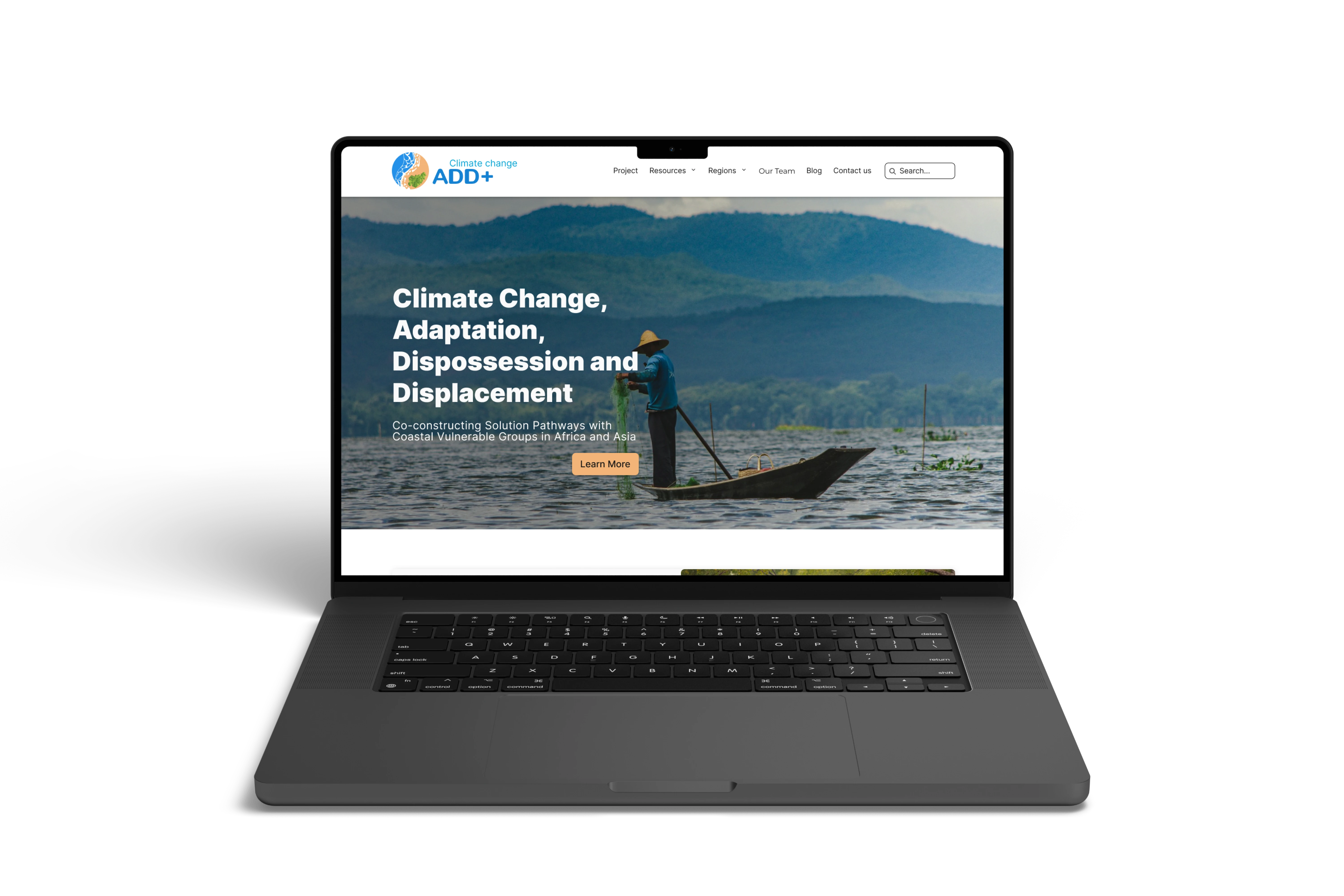
Hi-fi Designs & Prototyping
The high-fidelity designs incorporated the project's visual identity and refined the user experience based on feedback from the lo-fi testing phase.
High-fidelity designs for the ADD+ website
Conclusion
Challenges
- • Convincing Stakeholders on UX Best Practices – The principal investigator preferred a hierarchical, multi-page team structure, whereas I proposed a one-page card view with powerful filtering for better usability.
- • Overcoming Resistance to Change – To address this challenge, I onboarded the social media team and demonstrated how the proposed design would enhance user experience and accessibility.
Lessons Learned
- • Communication & Trust – Regular, detailed, and clear communication helps build trust with stakeholders and establishes credibility as a designer.
- • Strategic Stakeholder Engagement – Instead of direct opposition, collaborating with key team members can help advocate for user-centred design solutions more effectively.
Impact
- • Designed all the unique pages for the project website.
- • Established branding and visual identity.
- • Conducted research on best practices for website development post-design to guide the next stages.
Next Steps
- • Set up KPIs to measure website performance and track user engagement over time.
- • Analyze website traffic and usability feedback to iterate and optimize the site further.