Improving library borrowing efficiency to increase user engagement
Library App Design Challenge
Link to project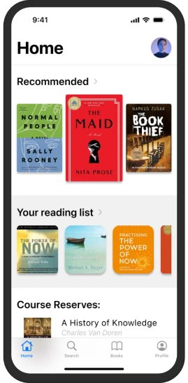
Role
UX/UI Designer, Product Designer
Duration
6 weeks
Responsibilities
User research, information architecture, wireframing, prototyping, usability testing
Tools Used
- Figma
Problem Statement
The Problem
The local library has experienced a significant 4-year decline in borrowing rates. Their current borrowing process remains largely analog and paper-based, creating friction for users who increasingly expect digital convenience. This misalignment between user expectations and library services has contributed to reduced engagement with the library's resources.
Goal
Design a user-friendly mobile application that modernizes the library experience, making it easier for patrons to discover, access, and manage library resources while increasing engagement with library services.
Research
Understanding Multiple Perspectives
My research focused on understanding both the library staff and visitor perspectives. Through secondary research and observations I gathered insights about librarians and library patrons to create a comprehensive view of the current system's challenges and opportunities.
Staff Perspective
Understanding the Librarian's View
I conducted in-depth research about librarians to understand their daily challenges and needs. This research phase was crucial in identifying both pain points and opportunities for improvement from the staff perspective.
Empathy Map
Says
We need a better way to help patrons find books and manage our resources
Thinks
There must be a way to make our processes more efficient and user-friendly
Does
Manages library resources, assists patrons, handles administrative tasks
Feels
Stressed about keeping up with increasing demands while using outdated systems
Staff Pain Points
Overburned: Feels overwhelmed by the increasing demands and limited resources.
Inefficient processes: Current systems and processes may be inefficient, leading to wasted time and effort.
User frustration: The librarian is aware of user frustration with the borrowing process, particularly when it comes to finding the books' location.
Staff Opportunities
Streamline processes: Automate tasks and simplify procedures to reduce the librarian's workload.
Improve user experience: Implement a user-friendly system that makes it easy for patrons to find and borrow materials.
Leverage technology: Utilize technology to enhance services, such as digital resources and self-checkout.
Visitor Perspective
Understanding the Customer's View
To complement the staff research, I conducted extensive research about library visitors to understand their needs, challenges, and expectations when using the library services.
Empathy Map
Says
I need to find a specific book. Is this book available? How long can I borrow this?
Thinks
About deadlines, assignments, or leisure reading.
Does
Searches for books, goes to library to find if the books is available, checks out books, returns books.
Feels
Anxious, excited, bored.
Visitor Pain Points
Difficulty finding books: Users may struggle to locate specific books, especially in large collections.
Complex borrowing process: The process of placing holds, checking out books, and returning them can be confusing.
Long wait times: Users may experience delays in receiving holds or checking out popular items.
Visitor Opportunities
Improved search functionality: Implement a powerful search engine that allows users to easily find books.
Simplified borrowing process: Streamline the checkout process, and provide clear instructions.
User-friendly interfaces: Design intuitive and accessible digital interfaces.
User Flow Diagram
User Pain Points
Since this was a web-generated design challenge and I was not working with a specific library, I did secondary research to lay out the average borrowing flow at the library. I used insights from my research to create the “current” user flow diagram which helped me unpack more pain-points, opportunities and insights.
User flow diagram
Flow Analysis Insights
Analysis of the user flow diagram revealed several key insights about the current borrowing process:
Flow chart analysis shows that book borrowing experience is significantly hindered by users' ability to find the location of desired library material.
Searching on the computer or mobile device in advance can help to minimize the time to find the desired library materials as compared to asking the librarian.
There is an opportunity to optimize the flow to minimum steps if we can remove the need for borrowers to hand over, the books to the librarians for checkout purposes.
Define and Ideate
Digital Solution Proposal
Based on my research and analysis, it was decided that a digital solution in the form of a mobile application would be best as the first/immediate product solution for improving the current borrowing flow for the local library. Below is the overview of my proposed borrowing flow using a mobile app.
Overview of the proposed digital borrowing flow
Low Fidelity Designs and Testing
Starting with low-fidelity wireframes allowed me to quickly iterate on the core functionality and user flows before investing time in detailed visual design. These initial designs focused on the key features identified during the research phase.
Initial low-fidelity wireframes exploring core functionality
Usability Study Details
Study Type
Moderated usability study
Location
Waterloo, Ontario
Participants
2 participants
Length
20 minutes
Usability Study Findings
The usability study revealed several key areas for improvement in the initial design:
Sign-in Instructions: Users were unclear about the sign-in process and requested clearer instructions.
Homepage Design: One participant found the homepage design monotonous and lacking visual interest.
Confirmation Messages: Both users expressed the need for clear confirmation messages after completing actions like placing holds or checking out books.
Terminology Clarity: The term 'Hold' was not immediately understood by one user in the library context.
Feedback
- User was unclear about the sign in page and asked for instructions-hence, should include log-in instructions.
- One user felt the homepage looked monotonous.
- Both users felt lost without confirmation messages upon securing a book hold and successfully checking out a book
- One user did not know what the word “Hold” meant in the given context.
High Fidelity Wireframes
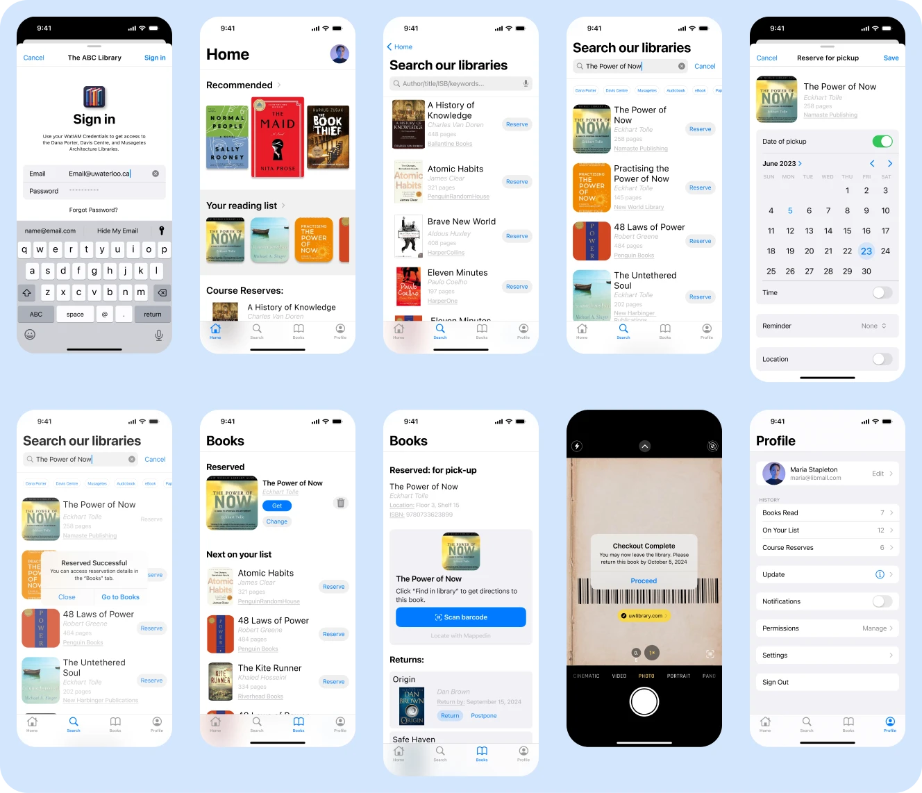
Based on the feedback from the usability study, I went on to make the high-fidelity wireframes. As an additional challenge, I decided to design thee mobile application as an IOS application to familiarize myself with building native IOS applications.
AB Testing
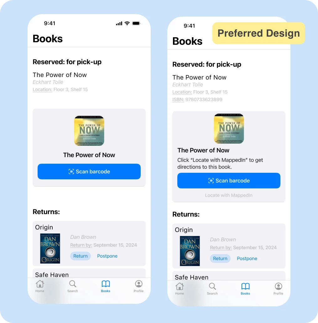
Users preferred the second design for several key features: it provided indoor directions to help locate books efficiently, included clear instructions for using the barcode card, and displayed the ISBN number which users found particularly helpful for reference.
Prototyping
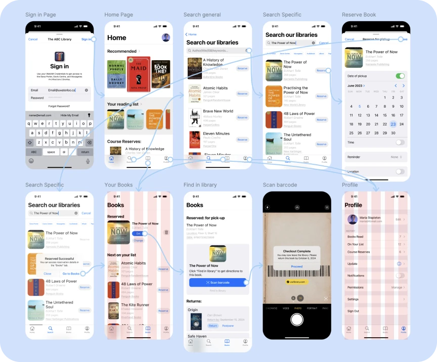
To finalize the process, I connected the screens and made my final prototype wholly representing the library borrowing flow.
Lessons Learned
Practice more native application designs for other operating systems other than IOS. Flow chart analysis is extremely helpful in cases where primary research is limited. Use neutral/non-suggesting communication style during usability interview/studies to ensure you don't influence the results.
Next Steps
For future iterations of this product, I would suggest adding a book return flow capability to the mobile app. Below is a flow chart analysis of the current return flow as well as a proposed flow through the mobile app option. Moving forward, I shall build up on this research to add these capabilities to the current solution.
Return flow diagram
Return flow diagram experience