Reducing new user confusion with an intuitive early subscription interface
Velodel-Landing page design for a bike rental company
Link to projectRole
UX researcher, UX/UI designer
Duration
1 month
Responsibilities
User interviews, paper and digital wireframes, prototyping, conducting usability studies, accounting for accessibility, iterating on designs and responsive design
Tools Used
- Figma
- Midjourney
Problem Statement
The Problem
Available bike rental companies in Waterloo provide limited information and services to customers. Users either face extra charges due to lack of information, or avoid the rental process altogether.
Goal
Design a landing page for the upcoming Velodel bike rentals which provides all the information and services potential bike renters would like to know.
Empathize & Define
- User interviews
- Competitive analysis
- Persona
- User Journey Map
- Pain-points
Ideate
- Information Architecture
- Low-fi wireframes & testing
- Hi-fi wireframes & testing
Prototype & Test
- Final design & prototyping
Research
Market Analysis
Velodel is a bike rental company startup which operates in the student town of Waterloo, Canada. The typical user is between 19-35 years old, and most users are college students or early career professionals. Velodel's goal is to make bike rentals worth it through cheap monthly, all-inclusive subscriptions.
User Research Insights
Many target users prefer bikes for their convenience for getting around campus. However, many fear getting their bikes stolen as this happens often in Waterloo. Also, users said they don't know how to maintain a bike, and are not ready to spend more each time there is a malfunction. Users say they don't really visit the websites for Neuron and Campus Bikes (main competition) due to their [either] high prices or low quality.
Persona

Max Ochieng
University Student
- Age/Gender:
- 24/Male
- Location:
- Waterloo, Canada
- Occupation:
- Full-time student
- Family Status:
- Single
- Tech Savvy:
- High. Uses various apps and websites daily for university and personal life.
Bio
Max is a busy university student who needs an intuitive website that provides him with all the information he requires about the bike rentals because he has a jammed-packed schedule and wants to save time on research.
Goals
- • Find affordable transportation options for getting around campus
- • Access clear information about rental terms and conditions
- • Ensure bike security and maintenance are taken care of
Frustrations
- • Existing rental services have hidden fees and unclear terms
- • Fear of bike theft in the Waterloo area
- • Limited time to research and compare rental options
- • Lack of knowledge about bike maintenance
Devices
(% of use when accessing the V2V website)
Uses laptop for detailed research and booking
Checks quick information and rental status on mobile
"I need a reliable and affordable way to get around campus without worrying about bike theft or maintenance issues."
User Journey Map
Understanding User Flow
I created a user journey map of Max's experience coming to, and navigating through, the landing page of Velodel in order to help identify possible pain points and opportunities for improvement. This visualization helped me understand the emotional highs and lows of the user's experience while trying to rent a bike.
User journey map highlighting key touchpoints and emotional states
User Pain Points
Security: High rates of bike theft in Waterloo leads many to fear owning or renting a bike
Convenience: Students need a convenient way to go around big campuses and not pay for expensive parking
Cost: Part-time students and those on co-op terms need affordable transportation options
Competitive Analysis
Neuron
Strengths:
User-Friendly App: The app is well-designed, intuitive, and easy to navigate.
Real-time Bike Availability: The app provides real-time information on bike availability and location, allowing users to plan their trips efficiently.
Cashless Payments: The app supports cashless payments, making the rental process convenient and secure.
Weaknesses: • Limited Bike Variety: Neuron primarily offers e-bikes, which might not cater to all user preferences. • Pricing Structure: Price is set by time travelled so users do not fully know the amount they spend. • Cost: Students find it expensive as at times it can even cost more than an Uber. • Potential for Technical Issues: As with any technology-based service, there's a risk of technical glitches or app crashes.
Analysis of Neuron's bike rental service and app interface
University of Waterloo Bike Center
Strengths:
Affordable Pricing: The university offers competitive pricing for students and staff.
Convenient Locations: Rental stations are strategically located on campus.
Simple Rental Process: The rental process is straightforward, often involving a simple ID check.
Weaknesses: • Limited Availability: Bike availability can be limited, especially during peak times. • Exclusive: Rentals are limited to University of Waterloo affiliates. • Less Tech-Driven: The rental process is less tech-driven compared to Neuron, which might not appeal to tech-savvy users.
Analysis of University of Waterloo Bike Center's rental service
Insights
User-Centric Design: • Prioritize a seamless and intuitive user experience • Conduct user testing to identify pain points and areas for improvement
Maintenance: • Provide real-time updates on bike availability and location • Develop a reliable system for tracking bike usage and maintenance
Communication: • Clearly display the cost for services without withholding any hidden fees • Include frequently asked questions • Provide opportunity to contact team
Ideation
Information Architecture
Even though I was only designing the landing page, I found it useful to make a sitemap for the future website to better understand what to include on the landing page. This required back and forth meetings with the client to make sure I implement their desires while keeping the design user centric.
Sitemap showing the planned structure of the Velodel website
Paper Wire-framing
Next, I sketched out paper wireframes for the landing page keeping in mind the user pain points and preferences. I then converted my paper wireframes to digital designs.
Initial paper wireframes for the landing page
First User Testing Feedback
After user testing and calls with clients the following feedback arose:
Design was too busy
User couldn't decide which portion of the website to focus on
Too much happening above the fold
Information was not clear and user did not understand what services Velodel provided
Client wanted more room/space between elements
Client wanted clearer display of information
Second Iteration
Improvements: Following the feedback from user testing I improved the existing design starting with a paper wireframe and then a digital wireframe. Goal: Cleaner design; More white space; Clear information; Clear CTAs; More user friendly.
Improved paper wireframes based on feedback
Digital version of improved wireframes
Second User Testing Feedback
Easy to navigate
Information is clear but is repeated and can be improved
"Overall felt a bit empty in terms of design"
Users wanted a more interesting UI
More style aspects
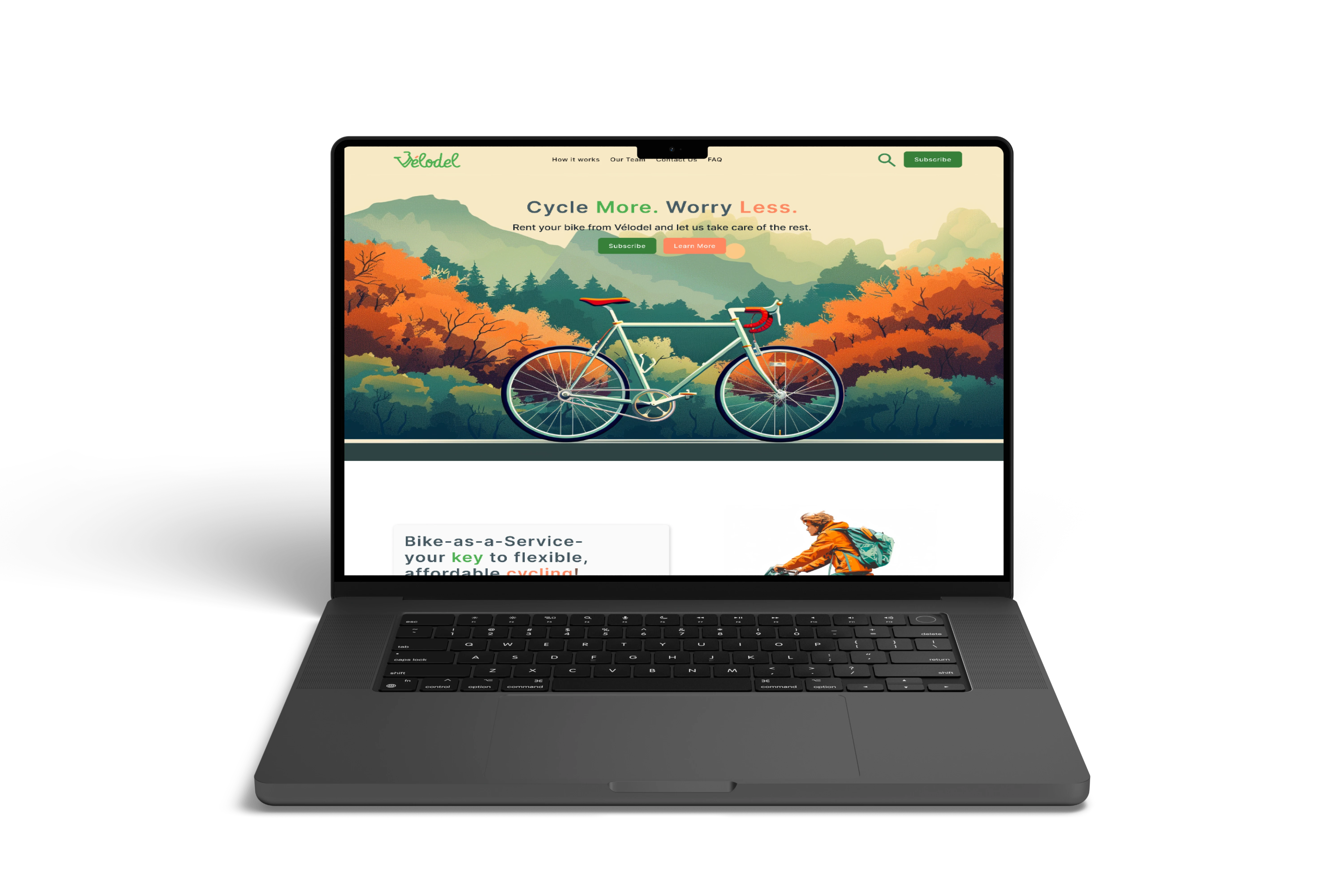
Final Design
Final design - Desktop version
Final design - Mobile version
Final design - Mobile version
Final Impact
Accessibility
- • I ensured visual hierarchy by using headings with different sizes.
- • I constantly double-checked colour choices to allow for optimal contrast.
- • I designed all the graphics on the landing page with alt text for easy screen reader access
Lessons
- • Create low-fi wireframes in Figma with adequate labeling
- • Don't move onto high-fi designs till the best content layout has been chosen through user testing
- • Create low-fi prototypes for initial user testing
Next Steps
- • Ideate on additional features as well as brainstorming on the rest of the pages.
Impact
Users found the landing page's layout intuitive and easy to navigate. Information was readily available and CTAs were clear.