Dashboard Redesign for Solar Performance Platform

Project Overview
Project Details
Role
UX UI Designer
Duration
2 months
Responsibilities
Dashboard redesign, Information Architecture, Design System
Tools Used
Problem
Swish Solar is a clean-tech startup delivering self-cleaning nanotechnology + AI optimization to keep solar panels operating at peak performance. Their platform relies heavily on a client-facing dashboard that communicates plant performance, soiling levels, energy loss, and cleaning cost estimates—data that directly influences operational decisions and long-term ROI. However, the existing dashboard was still at an MVP maturity level, with fragmented navigation, unclear workflows, and inconsistent UI patterns. These issues created friction for users and limited the company's ability to scale their product suite.
Outcome
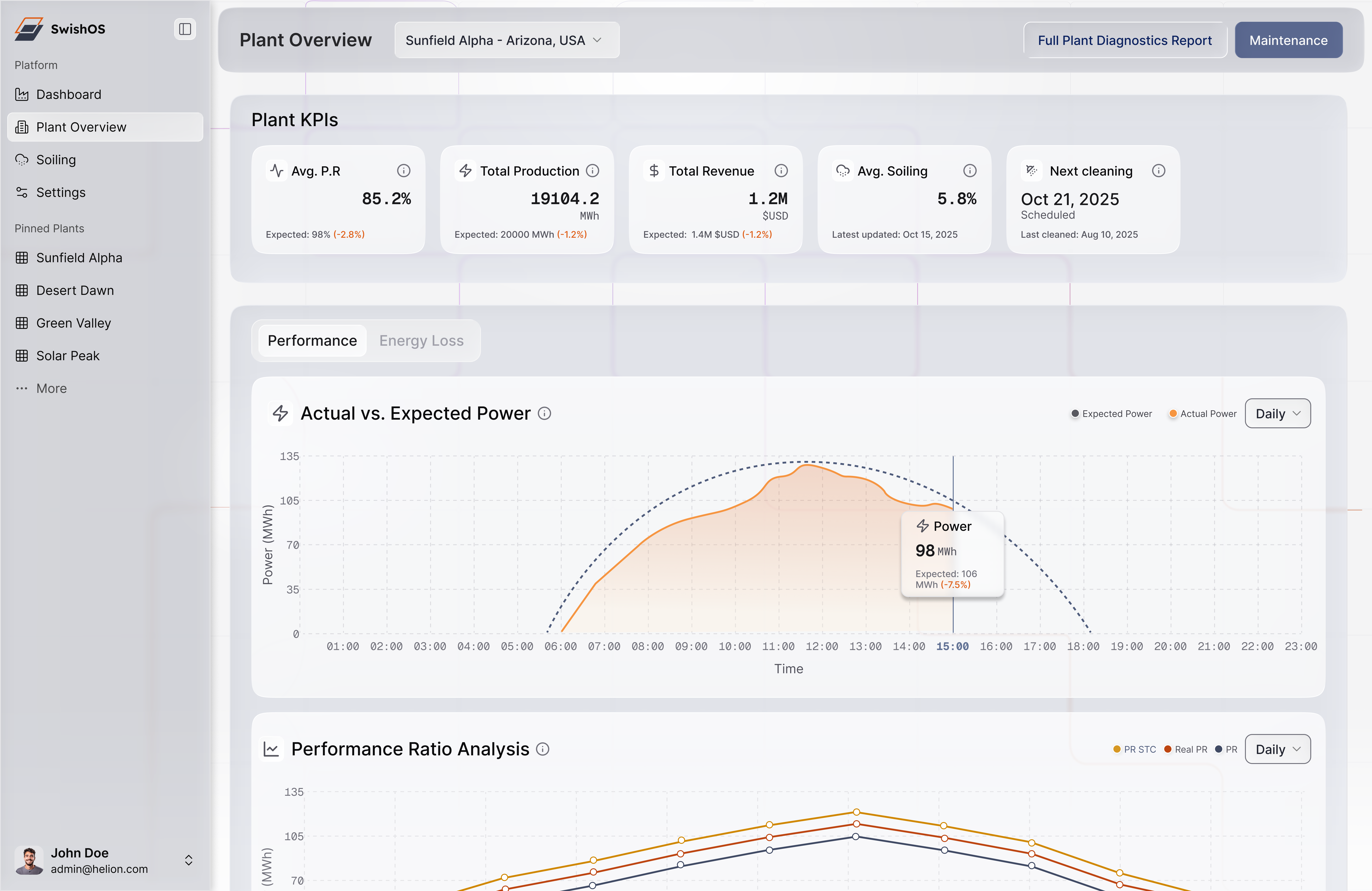
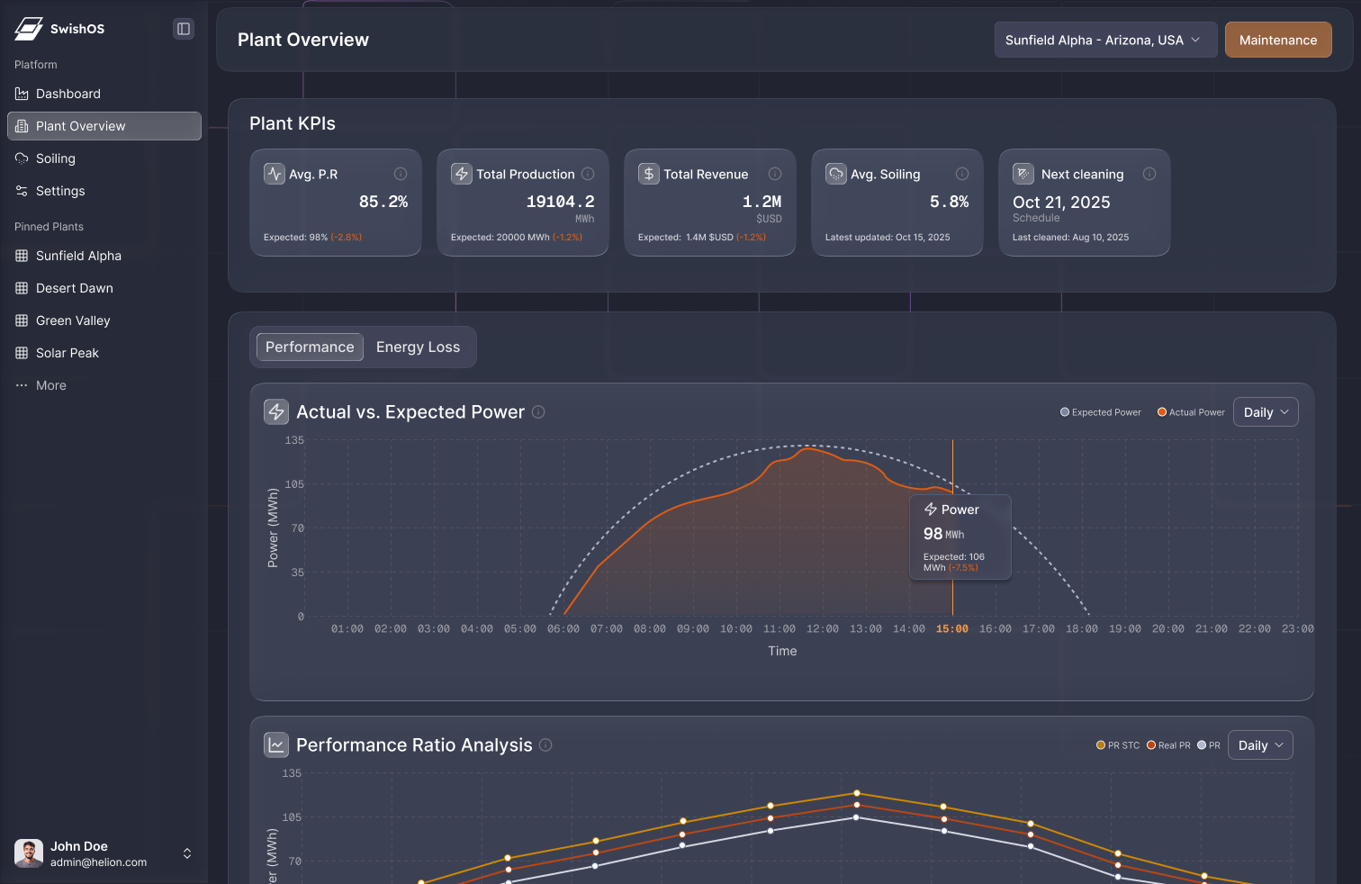
Successfully redesigned the SwishSolar dashboard to improve clarity around performance data, centralize critical cost-calculation workflows, increase client trust and engagement, and establish a scalable design system for future products. The redesign delivered improvements across product, engineering, and client experience with measurable impact on efficiency, user confidence, and engagement.
Key Results
Design & Development Time
Cut future design and development time through scalable design system and reusable component library
User Confusion
Reduced user confusion through unified, transparent cost-calculation module in single structured page
Client Engagement
Increased client engagement after centralizing plant insights and improving information architecture
The Business Problem
Although the dashboard functioned, it wasn't supporting Swish Solar's business strategy.
Key Business Risks
- Lost credibility with enterprise clients due to scattered data and unclear insights.
- Longer sales cycles because teams struggled to demonstrate ROI with disjointed visuals.
- Higher development overhead from the absence of a design system—every update required one-off UI fixes.
- Missed operational savings for customers when they couldn't accurately interpret soiling levels or cleaning schedules.
Ultimately, the dashboard created cognitive friction at the exact moments where clients needed to make fast, financially impactful decisions.
User Challenges
Interviews, product walkthroughs, and heuristic evaluations highlighted deeper UX issues:
- Calculation inputs were separated across multiple pages, forcing users to jump back and forth to estimate cleaning costs—leading to errors and frustration.
- Important plant insights were scattered rather than grouped by user mental models (performance → loss → recommended action).
- Visual inconsistency increased cognitive load, making it harder to trust the data or act on it.
- Lack of labels and guidance left operators unsure whether the data reflected real-time performance or projections.
These issues directly impacted how quickly and confidently users could take action.
Original Dashboard UX Issues: The original version placed significant cognitive load on users through scattered data points, inconsistent visual hierarchy, unclear navigation patterns, and fragmented workflows that forced users to jump between multiple pages to complete simple tasks.
Clients rely on these insights to justify investing in Swish's cleaning technology. Without clarity, the product loses credibility → lower adoption → slower sales cycles.
Strategic Approach
Before sketching or wireframing, I aligned the redesign with business KPIs and product goals:
1. Centralize the Core Decision-Making Workflow
Users needed one place to:
- View performance and soiling impact
- Understand energy loss
- Estimate cleaning costs
- See recommended actions
Unifying these into as few, structured modules as possible, reduces decision friction and supports faster operational responses.
Aligning redesign with business KPIs and product goals
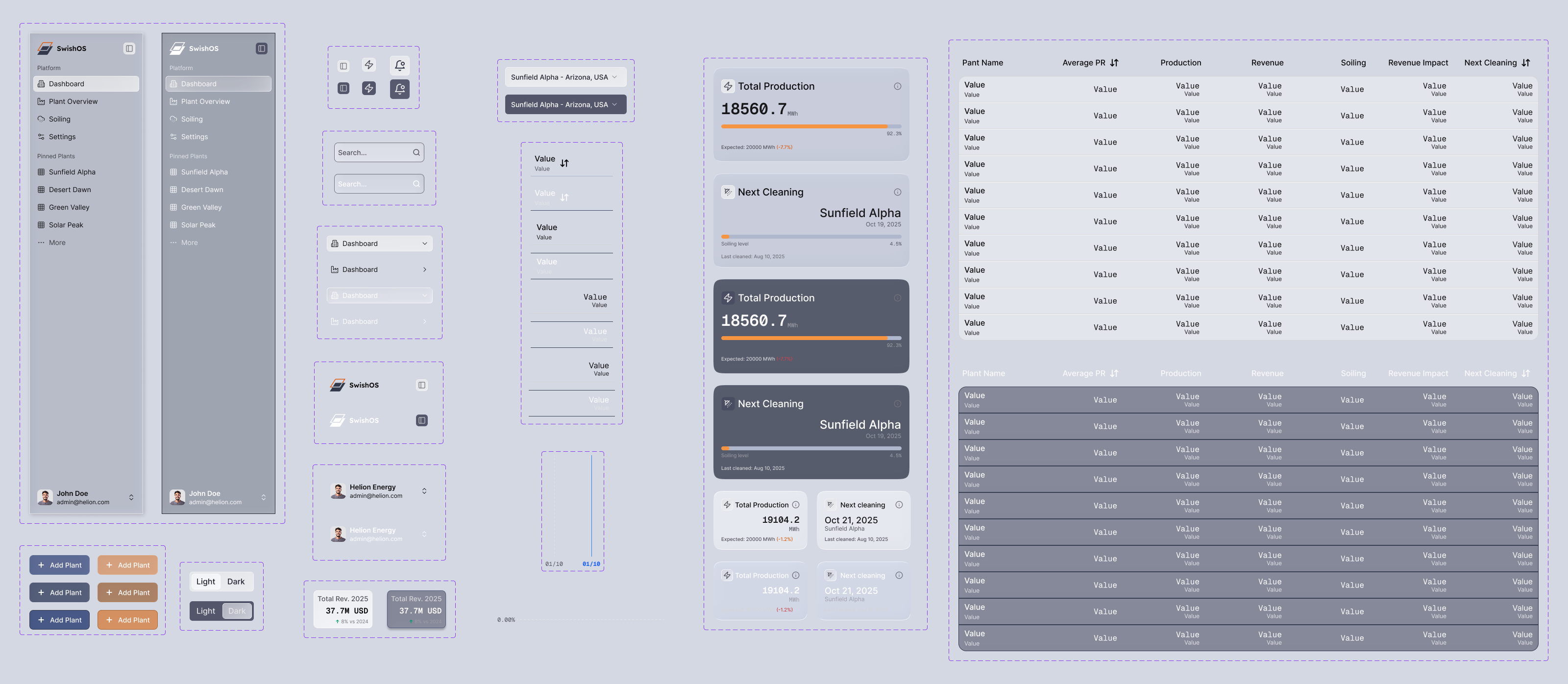
2. Reorganize the Information Architecture for Clarity and Speed
Analyzing the original information architecture revealed a lack of coherent navigation, logical content and page duplication. Key information was dispersed across disconnected pages, making critical plant insights hard to locate and slowing down user workflows.
Analyzing the old information architecture
User Thinking Model
I mapped user journeys and key data relationships to create a hierarchy that mirrors how operators think. The user thinking model that promoted the best flow based on user input:

Conceptual Data Modelling
I reorganized the content into clear categories with intuitive navigation and data relationships.
3. Build a Reusable Design System for Long-Term Scalability
To reduce Swish Solar's engineering overhead and keep the product visually consistent, I created a component library with standardized patterns for:
- Data visualizations
- Cards and grid layouts
- Calculators and input structures
Comprehensive design system and component library
4. Strengthen Visual Credibility
Because the dashboard functions as both an operational tool and a sales touchpoint, improving visual polish directly supports trust and enterprise expansion.
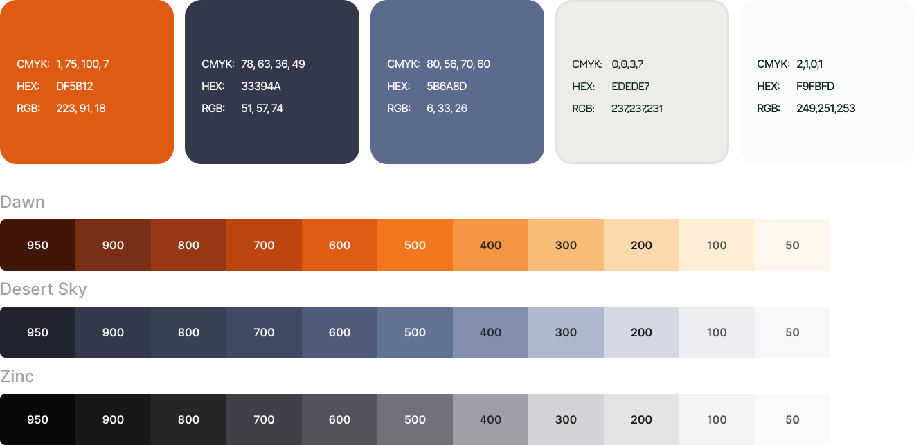
Color system to strengthen visual credibility
Design Solutions
The redesigned dashboard focuses on creating a unified, intuitive experience that empowers users to make fast, data-driven decisions.
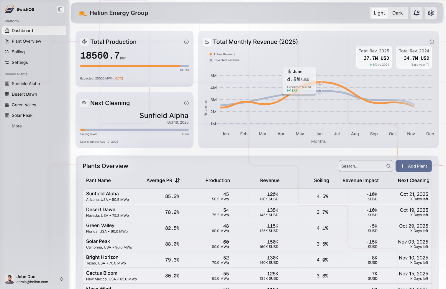
Home Dashboard - Light Mode
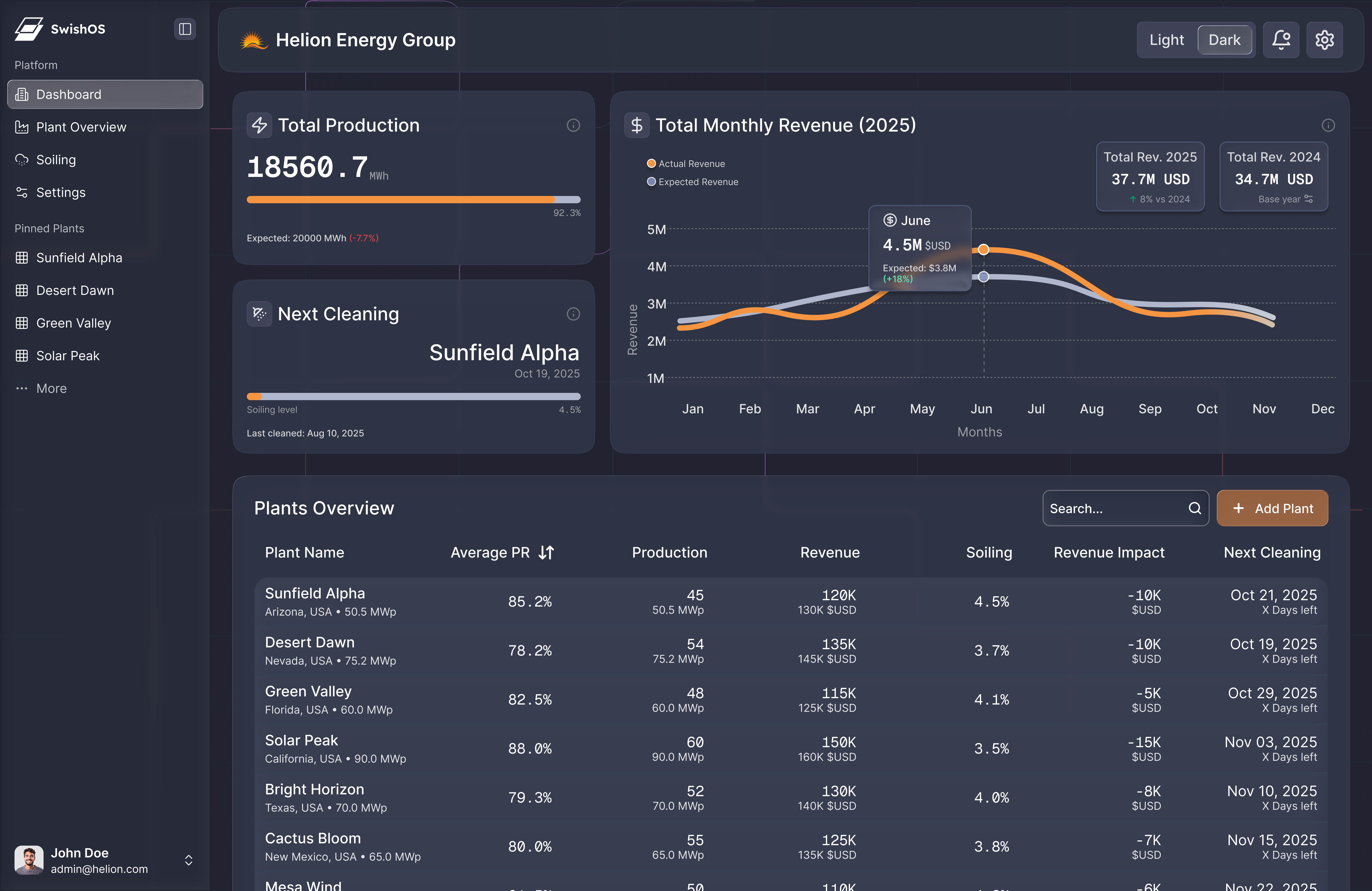
Home Dashboard - Dark Mode
Plant Analytics - Light Mode
Plant Analytics - Dark Mode
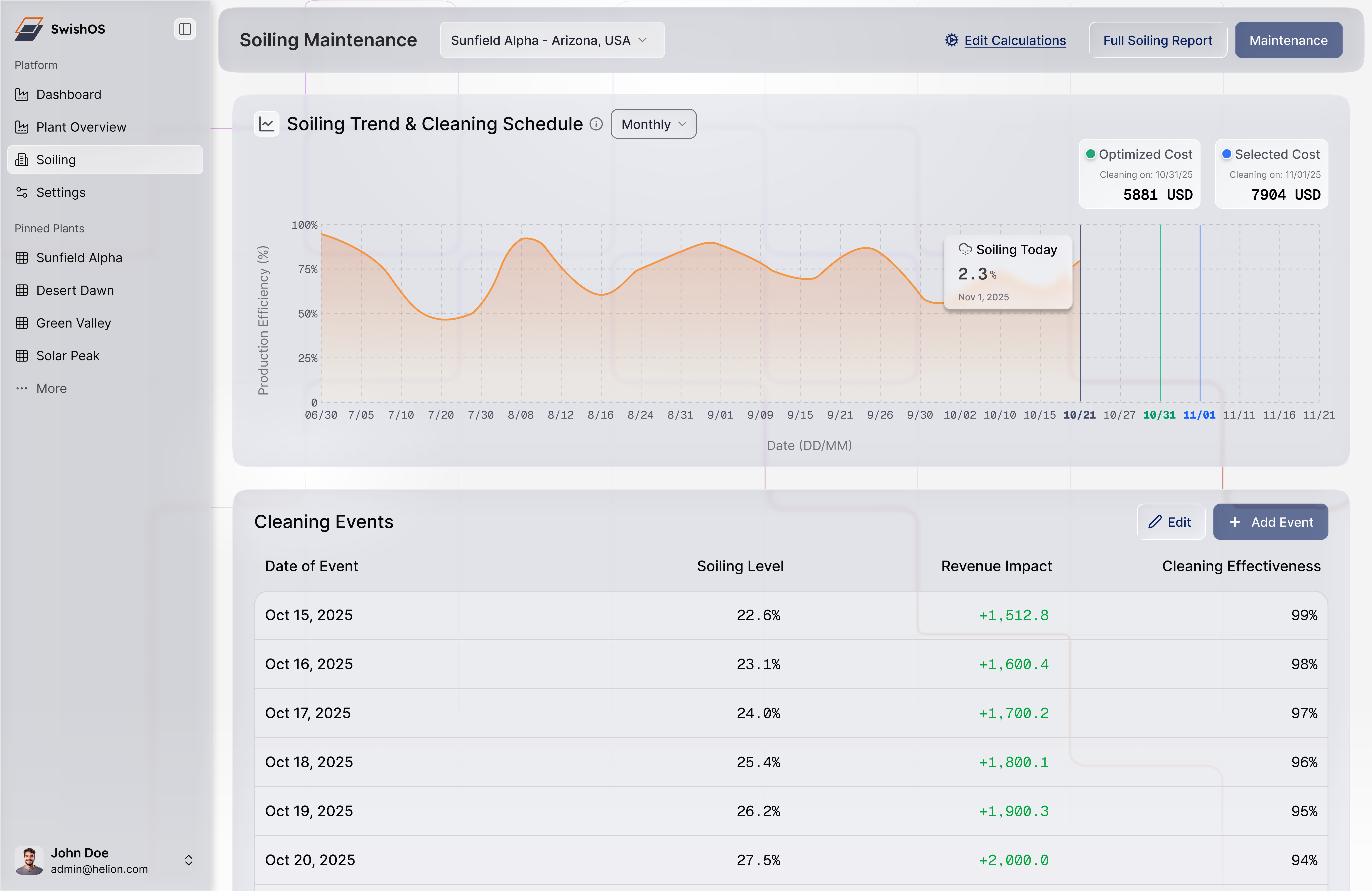
Soiling Analysis - Light Mode
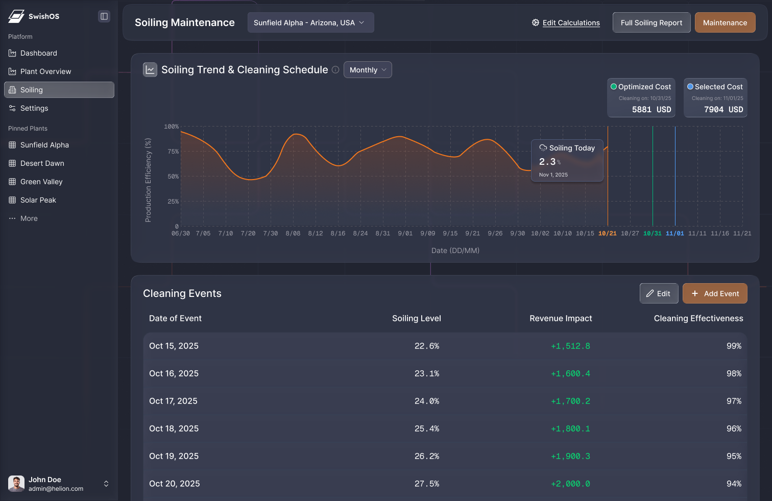
Soiling Analysis - Dark Mode
Outcomes
The redesign delivered improvements across product, engineering, and client experience.
Key Results
-70% Design & Development Time — Cut future design and development time through scalable design system and reusable component library
-60% User Confusion — Reduced user confusion through unified, transparent cost-calculation module in single structured page
+28% Client Engagement — Increased client engagement after centralizing plant insights and improving information architecture
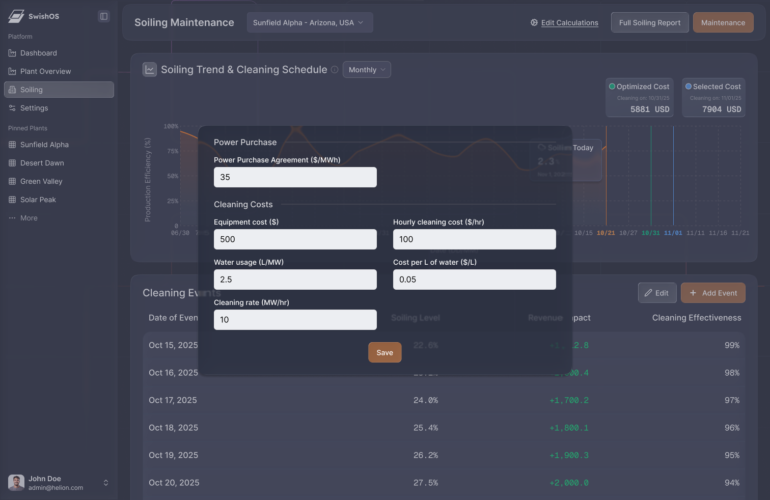
Unified Cost-Calculation Module
The previous multi-page workflow was merged into one decision screen with:
- Clear inputs grouped logically
- Transparent calculations
- Direct visibility into energy loss vs. cleaning cost
This reduced errors and allowed operators to confidently schedule maintenance.
Streamlined Information Architecture
The redesigned IA creates a predictable and intuitive flow. Related metrics sit together, enabling faster interpretation and reducing mental switching.
Scalable Design System
The component library now ensures:
- Faster feature updates
- Consistent UI patterns
- Reduced development time
- A coherent brand identity across future tools
Data Visualization Enhancements
Improved charts, indicators, and comparative visuals make it easier to detect anomalies and understand actionable insights.
Additional Strategic Value
- Stronger sales demos through clearer ROI storytelling
- Lower support burden due to improved clarity
- More scalable foundations for upcoming product features
Reflection
This project reinforced the importance of designing not just for usability, but for business impact. By aligning UI, information architecture, and system workflows with Swish Solar's strategic goals, the redesigned dashboard now helps clients make faster, more informed operational decisions—and positions the company for scalable, credible product growth.
Skills Strengthened
It also allowed me to strengthen my skills in:
- Structuring complex technical data
- Product thinking and strategic prioritization
- Designing for operational and business KPIs
- Building scalable component systems
- Creating dashboards that influence real-world decisions