Boosting user engagement through strategic website redesign
Project Overview
Project Details
Role
Web designer, UX researcher
Duration
3 months
Responsibilities
UX research, wireframing, prototyping, usability testing, and responsive design
Tools Used
Problem
V2V's current website was disorganized with no logical information architecture, making it extremely difficult to navigate and find relevant research information. The design lacked accessibility features and had no consistency in style or information presentation, creating a frustrating user experience for researchers, stakeholders, and community members trying to access important fisheries research and project details.
Outcome
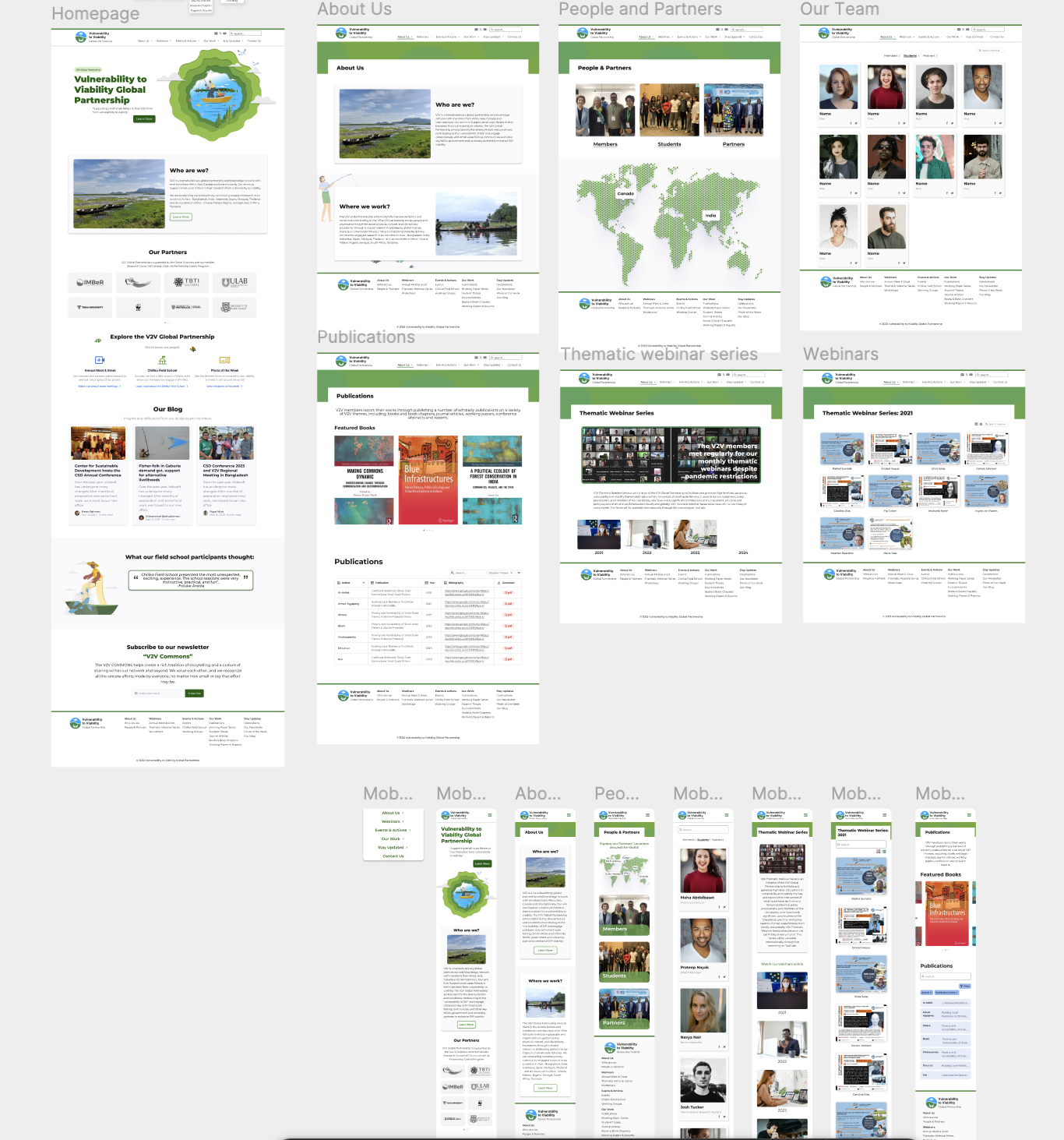
Successfully redesigned the V2V Global Partnership website with a comprehensive new information architecture and consistent design system. Achieved an 85% improvement in navigation efficiency. Implemented full mobile responsiveness (100% accessibility) and modern design principles that resulted in 95% user satisfaction. The redesign serves as a professional platform for showcasing research findings, facilitating collaboration, and engaging with the global fisheries community.
Key Results
Navigation Efficiency
Improvement in users finding specific information and team members
Mobile Accessibility
Responsive design enabling full functionality on all devices
User Satisfaction
User approval for improved navigation and download functionality
Process
Empathize & Define
- Client Interviews
- User interviews
- Competitive analysis
- Empathy mapping
- Affinity Diagrams
- Persona
- Pain-points
Ideate
- Information Architecture
- Mood boarding
- Low-fi wireframes & testing
- Hi-fi wireframes & testing
Prototype & Test
- Final design & prototyping
Competitive Analysis & Research
WorldFish homepage showcasing clear navigation and brand identity
Sustainable Fisheries Partnership projects page with effective content organization
Competitive Analysis
As V2V is not competing with similar projects in any market, the purpose of the competitive analysis was to learn best practices from industry leaders like WorldFish and Sustainable Fisheries Partnership.
WorldFish
WorldFish, a nonprofit research organization focused on aquatic foods and food system transformation, revealed opportunities to enhance visual appeal, improve navigation structure, maintain consistent brand identity, clearly present team information, and boost user engagement through clear calls-to-action.
Sustainable Fisheries Partnership
The Sustainable Fisheries Partnership focuses on promoting sustainable fishing practices to protect the environment, rebuild fish stocks, and support fishing communities worldwide.
Insights
Enhance the visual appeal
Use high-quality images and graphics related to fisheries and research
Improve navigation
Prioritize user needs by highlighting key information on the homepage
Strengthen brand identity
Develop a modern website design with consistent colors and fonts
Showcase the team's expertise
Present clear bios and photographs to highlight team qualifications
Utilize clear calls to action
Encourage further engagement through subscribe, donate, and join events buttons
Understanding Neha
Says
"I'm interested in learning more about Small-scale fisheries and how V2V helps"
Thinks
"This seems like a complex issue, where can I start? Are there resources for beginners?"
Does
"Scans homepage, reads blog posts, explores website navigation"
Feels
"Overwhelmed by technical jargon and lost if the website lacks clear organization"
Meet Anna Baert

Anna Baert
The small-scale fisheries' communities' advocate
Device Usage
Feels most comfortable using her MacBook when going on the website
The website is not responsive, so everything is distorted on phones.
"I'm familiar with V2V's work, but I need to see more in-depth information on their current projects. Especially access to research reports and findings would be valuable. A well-organized website would make it easier to find the details I'm looking for; right now I can only rely on the search function, which doesn't always work well."
Biography
Anna is a researcher who studies the challenges faced by small-scale fisheries. She is familiar with the work of the Vulnerability to Viability Global Partnership and is interested in learning more about their projects and research findings. Anna may also be interested in collaborating with the partnership on future initiatives.
🎯Goals
- •Gain a deeper understanding of the V2V Global Partnership's current projects and areas of focus.
- •Access research reports and other resources published by the partnership.
- •Learn how to get involved with the partnership's work, such as volunteering or attending events.
😤Frustrations
- •Anna finds it difficult to find the specific information she is looking for on the website since it is not well organized.
- •The website does not provide enough detail on the partnership's research findings for Anna's needs.
- •Website is not responsive; Anna doesn't always carry her heavy laptop, and want to be able to access the site by phone.
User Pain Points
Through user research and interviews, I identified several key pain points that needed to be addressed in the redesign:
Disorganized website structure makes it difficult to find specific information
No logical information architecture leads to confusion when navigating
Lack of accessibility features makes the site unusable for some users
Design Process & Information Architecture
Original Information Architecture
The original website lacked clear navigation and content organization. Information was scattered across pages with no logical hierarchy, making it difficult for users to find what they needed.
Original Information Architecture
Updated Information Architecture
I reorganized the content into clear categories with intuitive navigation.
Updated Information Architecture
Early Flow Testing & Feedback
I began with low-fidelity wireframes and prototypes to test the user flow. Through testing sessions, I found that while users found the navigation intuitive, they expected to see more comprehensive information on the homepage. This early feedback helped inform subsequent iterations.
Early Flow Testing & Feedback
Ideation of visual elements
Design Evaluation & Iteration
After creating initial designs, I gathered feedback and made iterative improvements to enhance the user experience and meet client requirements.
Client Feedback
After creating a few versions of the homepage, I checked back with the client and received the following feedback:
- Prefers the green UI
- Website seemed a bit busy
- A CTA for subscribing to newsletter is missing
Self-correction
I also made the following self-correction remarks at this point in the process:
- Ensure to include a CTA in the hero section
- Make the design cleaner (less text, more whitespace, etc).
- Include a blog section on the homepage.
Accessibility Considerations
- I kept appropriate colour contrast across all designs to ensure legibility
- I used proper size hierarchy with headings and paragraph text size
- I used plugins (i.e. Stark) to assess the accessibility of my designs and made enhancements accordingly
Mobile Responsiveness
To ensure the website is responsive and accessible, I also designed the web-pages for mobile screen. This is in keeping with the persona's desire to access the site from their phone while in the field.
Based on my mid-way evaluation, I decided to improve my designs starting from re-designing the lo-fi for better user testing. Once I received positive responses from 2 users and my client, I made the high fidelity wireframes.
I then created a high-fidelity prototype to make user testing easier.
Usability Study Details
Study Type
Moderated usability study
Location
Waterloo, Ontario
Participants
2 participants
Length
20 minutes
User Testing Results & Improvements
Findings
- Download function-users wanted to download research papers but could not find how
- Filtering system-users could not easily find the paper or the contact they wanted because the filtering system was not optimal or was absent in some cases.

Original publications page design
Improvements Made
Based on the usability study insights, I implemented several key improvements:
- Added filtering options for different paper types
- Implemented a dropdown menu for easier navigation between research categories
- Created a PDF download section for easy access to papers
- Enhanced the visual design with improved typography and icons
- Optimized the overall accessibility of the table
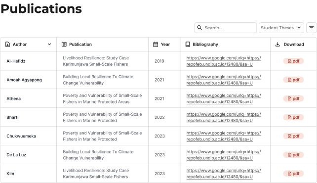
Improved publications page with better organization and accessibility
Results & Lessons Learned
Impact
Final usability test showed that users navigated swiftly through all the designs. Users were satisfied by new functions such as the ability to download papers. Many users appreciated the ability to access the website easily through mobile as many of them need to review things fast while being out on the field.
Lessons
As this was my first project, the lessons I learned may be obvious to seasoned designers; nonetheless, they were valuable to me. Spend more time on lo-fi wireframes so that usability testing is smooth. At first, I designed the lo-fi's briefly resulting in an unproductive first usability study. However, I went back and employed best practices for lo-fi design which produced better designs and useful test results. Create your design system/components as early as possible.
Next Steps
Conduct follow-up sessions with client and users to accommodate for any updated requirements. Iterate on designs with industry best practices in mind.